How We Grade Buildings, And Why
Published
Table Of Contents
We've been working towards grading buildings at Electrify Chicago for a long time, and in March 2025 we rolled out our first version. Let's walk through how it works, and why!
Why Grade Buildings?
We want to make it easy for folks to see, at-a-glance, whether a building is “good” or “bad” compared to other city buildings. But good and bad are relative, so let's explain what our team means by that.
Our North Stars - Energy Use & Energy Mix
At Electrify Chicago, we're focused on the impact of buildings on climate change, and on encouraging buildings to reduce their emissions, so we have two primary criteria for what makes a building good:
Our Highly Rated Buildings:
- Use As Little Energy As Possible Per Square Foot
- Use Primarily (Or Only) Electricity, Rather Than Burning Fuels For Energy
The first point is easy to explain - the less energy a building uses per square foot, the lower emissions it has, and this metric is agnostic to building size. We considered grading by total emissions, but that would mean that incredibly efficient large buildings could never get an A grade.
For the second point - electricity can be made without creating emissions. In Illinois, we have a large fleet of nuclear plants that create low-carbon electricity, and a growing numbers of solar and wind plants joining our grid. That means that two buildings with the same energy use, but one using electricity and one using fossil gas, are very different - in 10 years, without any internal changes, the all-electric building will have reduced its emissions as the grid gets cleaner year-by-year.
Some Examples Of Each Grade
To demonstrate what some good and bad buildings look like, here's a set of buildings with each letter grade:


Here's a few tidbits about these buildings:
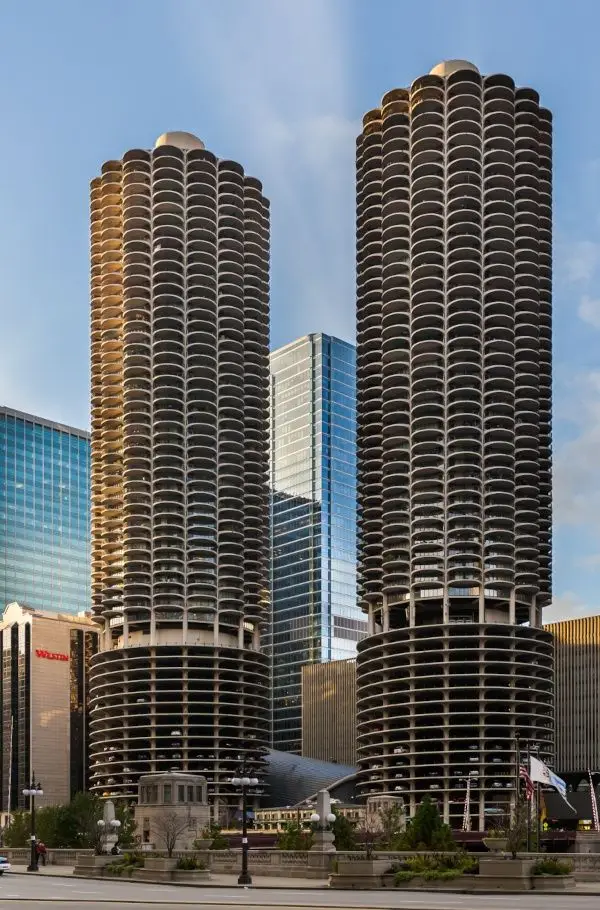
- Marina Towers are all-electric (giving them an A for Energy Mix) and a bit more energy efficient than the average benchmarked building (giving them a B for Emissions Intensity), and an overall A grade.
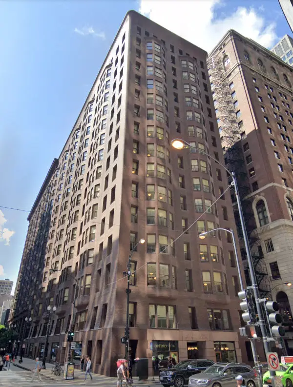
- The Monadnock Building uses mostly gas (giving it a D for Energy Mix) but is very energy efficient due to it's several foot thick brick walls (giving it an A for Emissions Intensity) and an overall B grade.
- The Art Institute of Chicago uses mostly gas (giving it a C for Energy Mix) and is a lot less energy efficient than the average benchmarked building (giving it an F for Emissions Intensity), and an overall D grade.
The Actual Formula
- 50% GHG Intensity - this is a percentile compared to the other buildings in the data, so the highest score (an A) goes to a building with lower emissions intensity than 80% of buildings.
- 40% Energy Mix - this is a percentile compared to the other buildings in the data in terms of how much electricity (including district chilling, where a central building cools water and then distributes it) the building uses. So the highest score (80%, an A) goes to a building with less gas use than 80% of buildings.
- 10% Consistent Reporting - this is a simple share of how consistently a building reported. 80%+ reporting gets an A.
Limitations: We Don't Know What Goes On Inside A Building
One of the biggest limitations of the city benchmarking data is that, compared to a formal energy auditing process, no information is collected on how a building is used. The same energy use and emissions intensity is very different if a building:
- Is open 24/7 to the public
- Runs refrigerators and freezers to keep food safe
- Heats, cools, and filters millions of gallons of water for aquarium exhibits
What We Know From The Benchmarking Data

Since we can't consistently get such information on the internals of each building, we grade all buildings compared to all other city buildings. This means that some buildings are marked as average that should be expected to perform better (say because they are an office building) while justified high energy intensity uses (like aquariums) will be penalized.
The Last Piece - Anomaly Detection
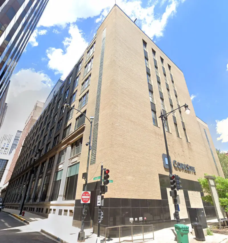
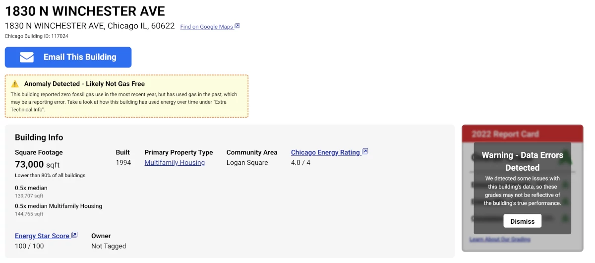
Looking purely at the latest data, some buildings appear to be incredibly efficient, and use very little energy. Some buildings, for example, report 0 natural gas use in their latest year. But does anything about the gas use of 1830 N Winchester Ave. (from 2022) look suspicious to you?
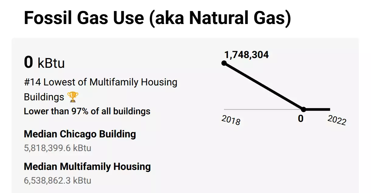
This building reported 0 gas use in 2021 to 2022, but had 1.7 million kBTUs of gas usage in 2018. We can pretty safely say, this building didn't actually use 0 fossil gas, but instead just failed to report their gas usage. Although it is possible buildings fully electrify, we'd expect to see a large increase in electricity use as gas heating moves over to electric. Physics dictates we still need energy to keep buildings warm, no matter the fuel type!
To this end, we try to detect and flag such data anomalies - you'll see a warning at the top of the building's page, as well as on the report card, like so:
Have Feedback On Our Grading?
If you have suggestions on how we can make our grading better, from improved anomaly detection to new data sources we can integrate, let us know, by filing an issue on our GitHub!