Release Notes
April 3rd, 2026 - Update to Map Geocoding
We've introduced changes to our data pipeline to correct the geocodes for buildings in our dataset. Previously, our Map component had been relying on incorrect coordinates being reported from the city's raw data. With this update, 21029 / buildings are now visible on the map in their proper locations!
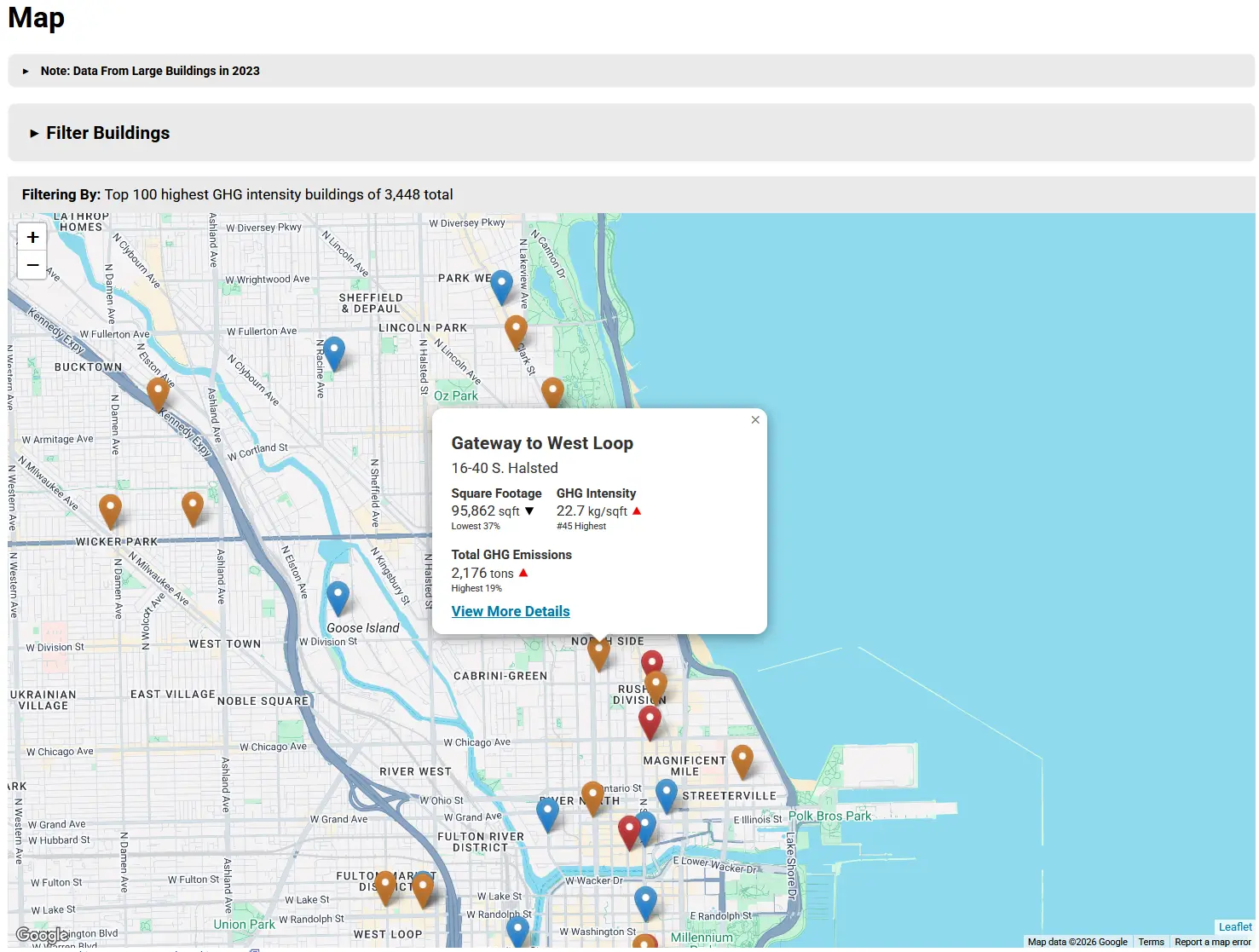
Map Pins Before
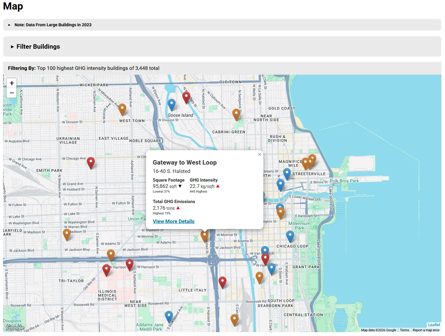
Map Pins After
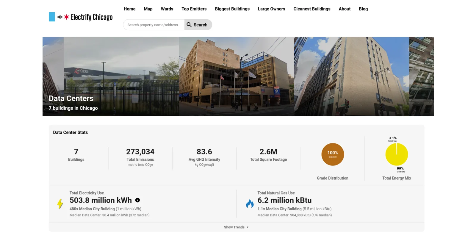
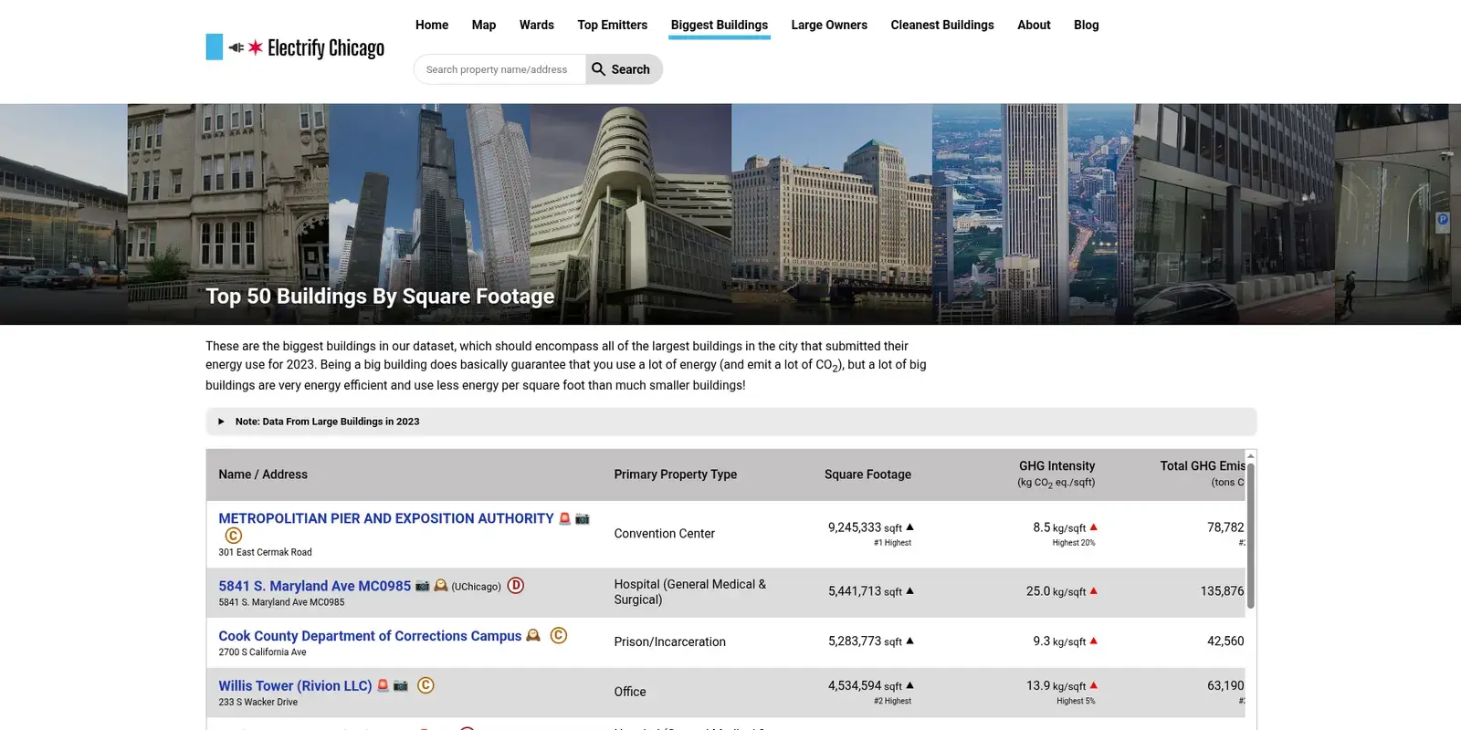
March 3rd, 2026 - New Property Type Pages
We added new property type pages (like Data Centers or Museums), to make it easy to learn more about all properties marked as a certain type! Previously, clicking a property type on a building page just took you to a filtered search, but now each property type has its own dedicated page with critical stats and graphs and images of a sample of those buildings.
Each property type page now includes a stats panel with total emissions, average GHG intensity, total square footage, grade distribution, and total energy mix. You can also expand a Trends section to see graphs of how the buildings in that property type have changed over time.
September 22nd, 2025 - Enhanced Building Owner Pages & Hero Imagery
We made significant improvements to building owner pages to make them more compelling and informative. Each owner page now features a hero that showcases images of the buildings they own, showing a quick preview of some of their properties. We've added this hero imagery to other pages, like our all electric page!
Building owner pages now also include additional statistics and graphs to help you better understand each owner's environmental impact, including total square footage, total emissions, average greenhouse gas intensity, and a breakdown of their buildings' grades.
Additionally, we've improved meta imagery across the site - pages now have proper social media preview images, making them look better when shared on social platforms!
Update Oct. 2025: We've now added these same stats and graphs to the ward pages as well!
Before
After
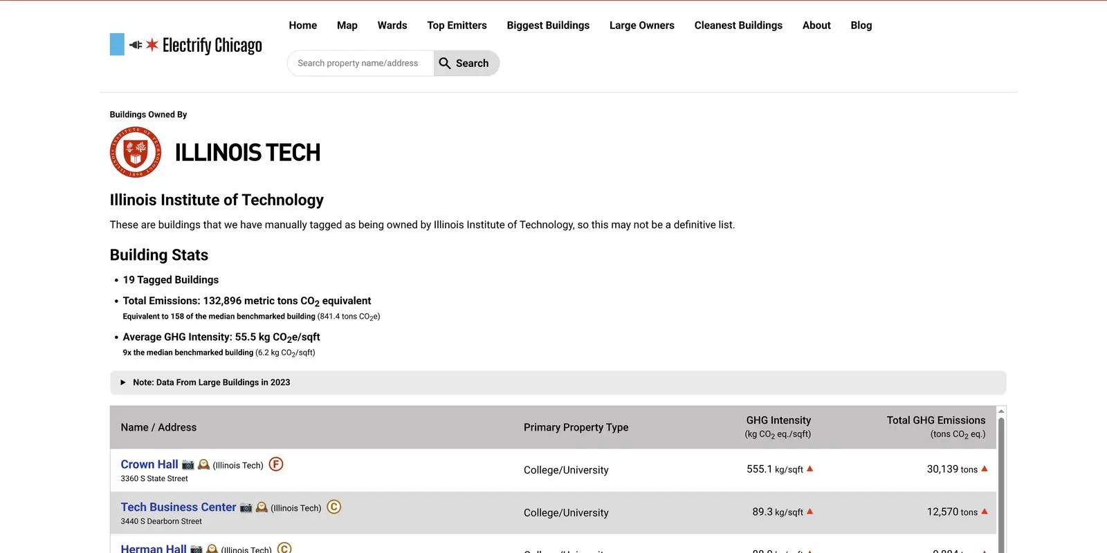
IIT Before
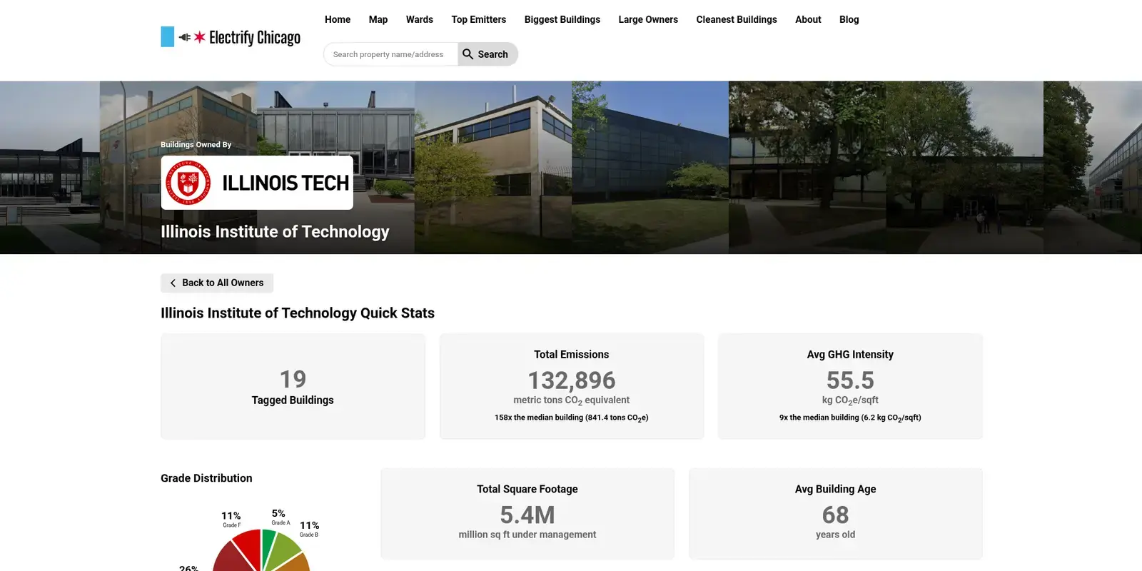
IIT After
August 22nd, 2025 - Data Update to 2023 & Citywide Stats
We updated the source data to the year 2023, bringing in the latest building emissions and energy data. This update includes 61 new buildings that submitted data for the first time and 288 buildings that stopped reporting from the previous year.
You can track building participation with our new Latest Updates Page! discover which buildings joined or dropped out of Chicago's energy benchmarking program between data years.
Want to see the bigger picture? Check out our new Citywide Stats Page! We've got a variety of graphs that reveal citywide trends over time, so you can see if Chicago buildings are getting cleaner or dirtier year over year.
August 5th, 2025 - Improved Printing for Buildings
We added a new print button that makes it easy to print our building pages, so you can print off a building that you're interested in. Our print mode removes navigation elements to focus on the building data and make pages more suitable for printing or saving as PDFs, including a QR code so folks who see the printed page can see the full data.
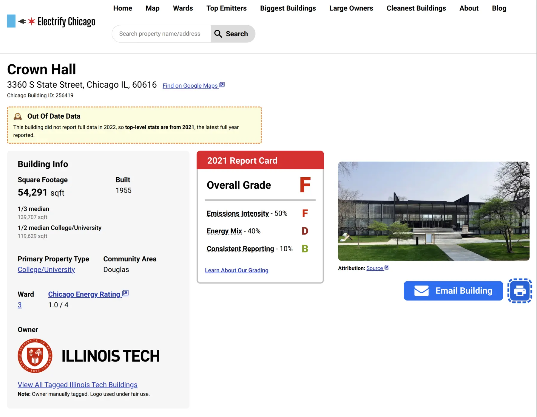
New Print Button
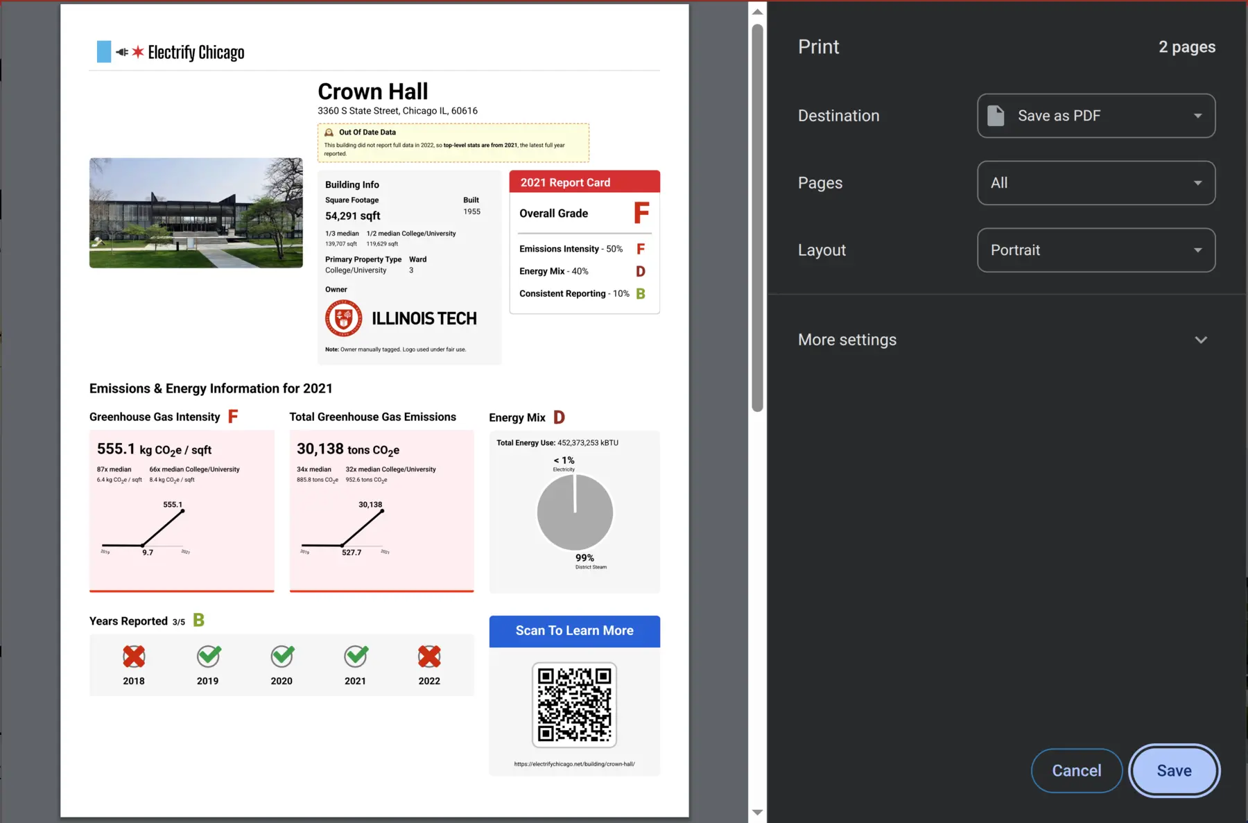
Print Preview
June 6th, 2025 - Added Ward Info & Pages
Buildings now have their ward shown on the building details page, and
there are pages for all of Chicago's 50 wards. These are linked from
an individual building, our Wards Page,
or can be found directly at
electrifychicago.net/ward/WardNumber (e.g.
https://electrifychicago.net/ward/1).
March 14th, 2025 - Building Grades v1
We wanted to make buildings more easy to understand at a glance, so you can quickly see if a building is a top performer or highly polluting. After months of hard work, we released our first version of building grades, based off of emissions intensity, energy mix, and consistent reporting.
Want to learn more? Read About Our Grading!
Our Homepage With Grades (as of March 2025)
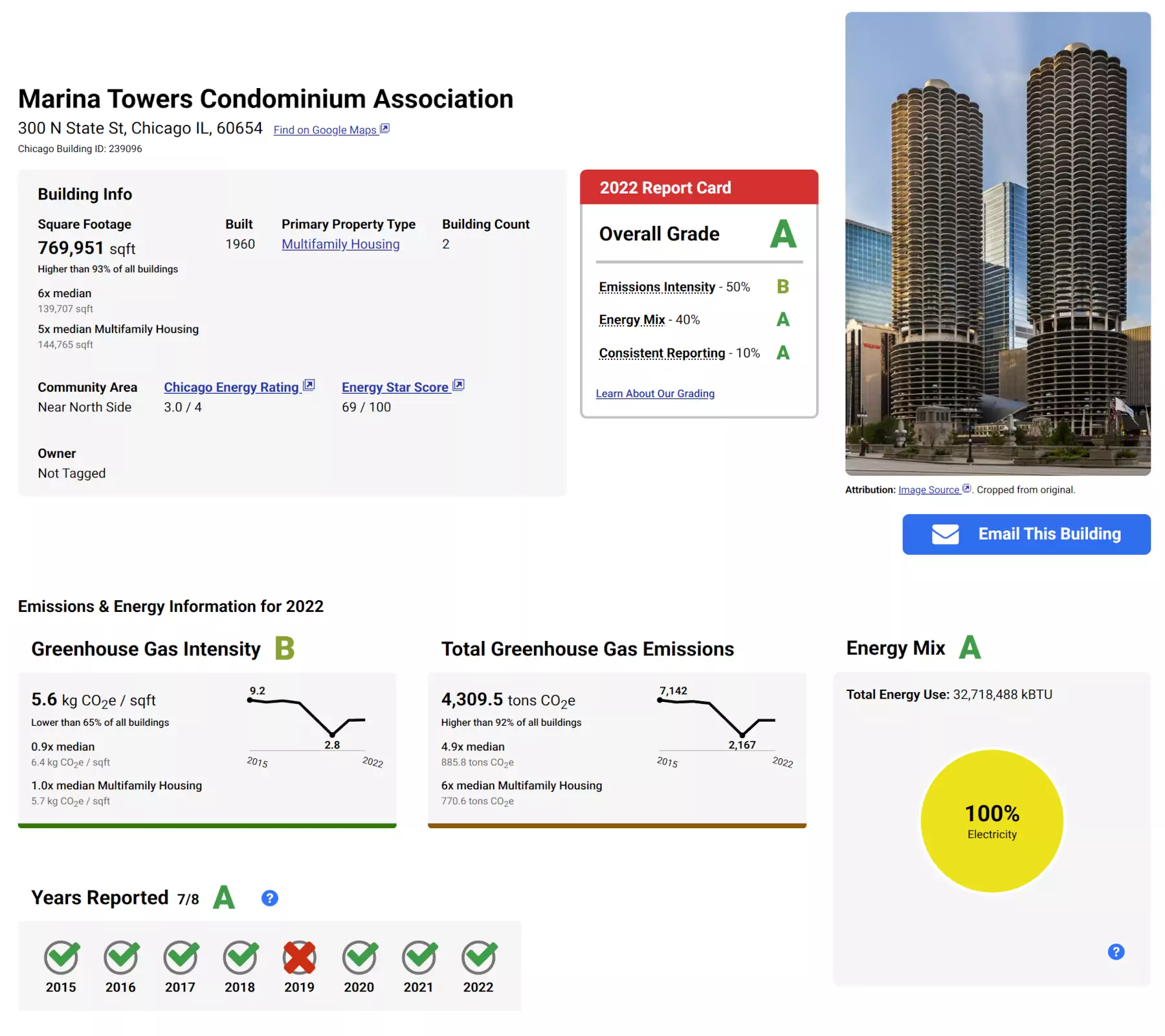
A Sample Building With Its Report Card (as of March 2025)
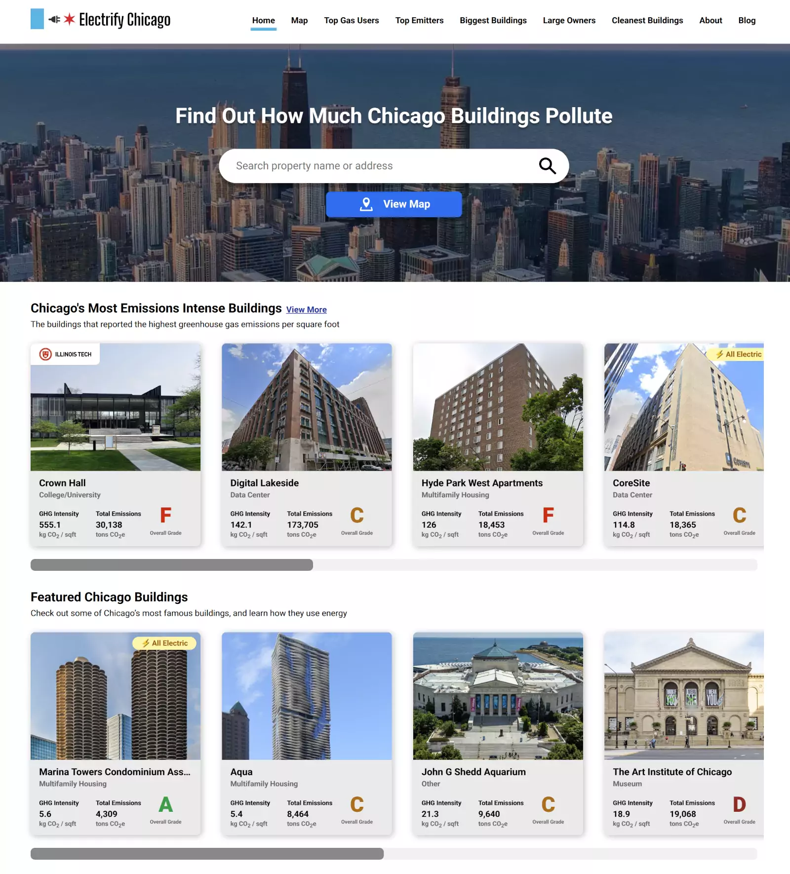
February 14th, 2025 - Homepage Redesign
We redesigned the homepage to make it more visually appealing and prompt people to our two most common features - our search and our map page. We also added some featured buildings, like museums, to encourage people to explore the site for buildings they know about!
Before
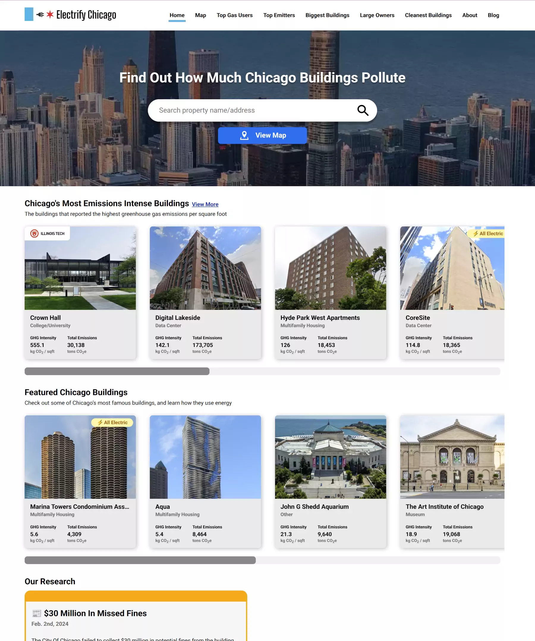
After
August 30th, 2024 - New Visualizations for Historic Changes & Energy Mix
We added new graphs to help visualize how buildings have changed in their emissions, emissions intensity, and energy use over time, and a new pie chart that shows the mix of types of energy a building consumes, making it easy to see at a glance if a building is mostly using electricity, fossil gas, or something else!
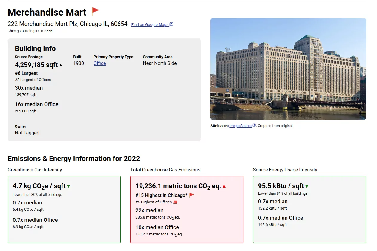
Before
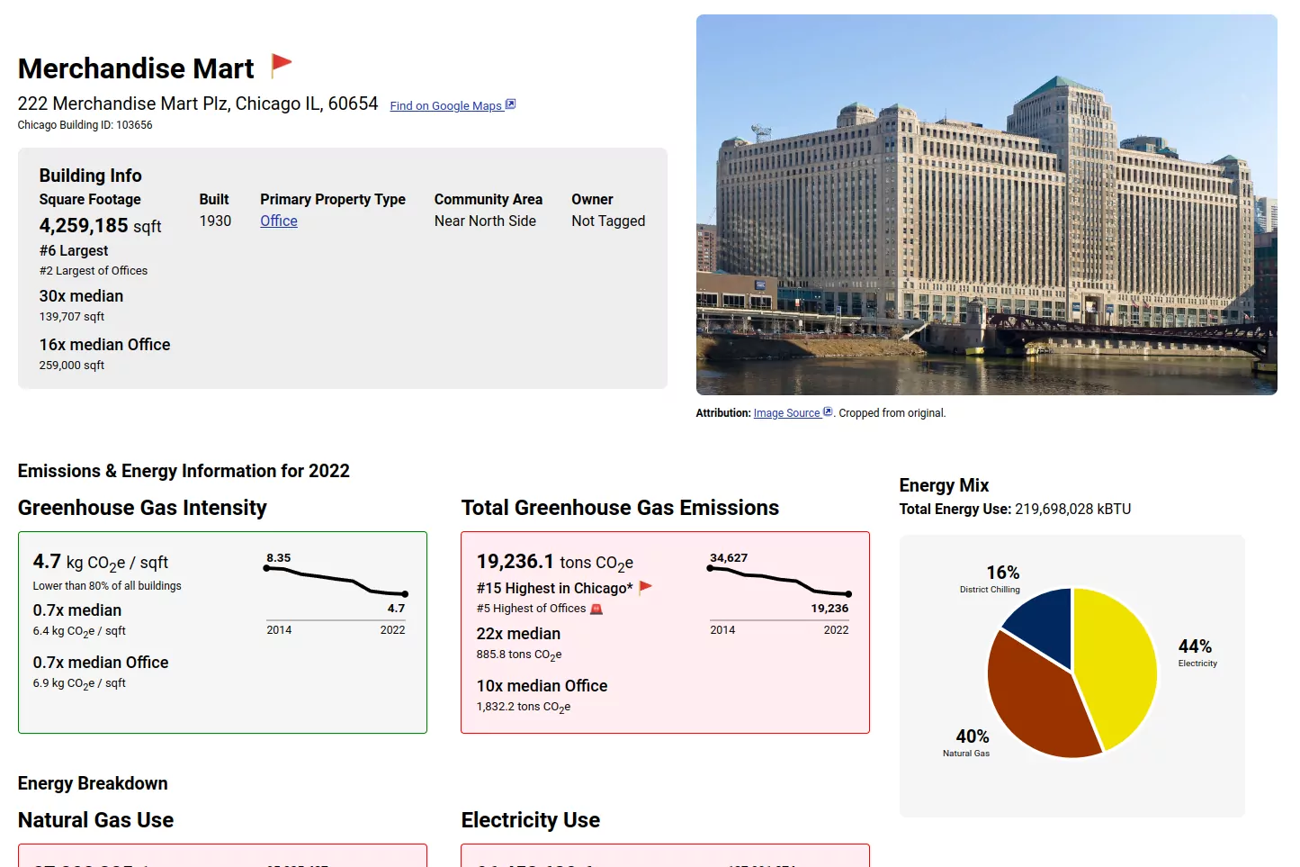
After
April 2nd, 2024 - Data Update to 2022
Updated the source data to the year 2022, and dropped the filter limiting buildings to the latest year on most pages, so that dirty buildings that didn't report in 2022 still show up on our largest emitter lists. Buildings shown that have old data now use a mantel clock emoji (🕰️).
August 30th, 2023 - Data Update to 2021
Updated the source data to the year 2021, which prevents being able to access 2020 data (for now) but also adds all reported buildings, removing the filter for emissions > 1,000 tons. Additionally, buildings that did not report in 2020 will have their latest year of data shown, so only buildings with data in 2020 and 2021 have data loss.
We will be working on showing historical data, including comparisons, in a future update.
Found a bug or have a feature request? File an issue on the Electrify Chicago GitHub !